When the launch of the Business Edge Alumni Network was proposed I became involved in designing the brand identity for the group beginning with my research on the diverse community. This network is a place for industry professionals to leverage their collective aspirations and experience in advancing career growth within Canada. The network today is coexisting through the WhatsApp platform which entails several privacy issues. I believed, this privacy concern needed to be addressed, where the need to give personal information to make connections online could be prevented while the data could live on the encrypted servers. Most importantly, my goal was to integrate a community professionally moving away from the core definition of ‘social networking’. The overall focus of this inspired me to conceptualize a mobile app which I named ‘Groopy’.
Background
Social media has built a phenomenal character for users in a ‘social networking’ environment and allowing them easy transaction of personal data such as text, images, video, and opinions in general. My first concept banked upon connecting people outside of the typical ‘social networking’ definition, a professional network that is nurtured in exchanging views but those which are not meant to be ‘shared’ outside the realm of the network due to its structure of belonging only within the current stream of thought. Thus the goal of Groopy is to connect groups of people on an enterprise platform as illustrated below, and it’s an antithesis of a social network.
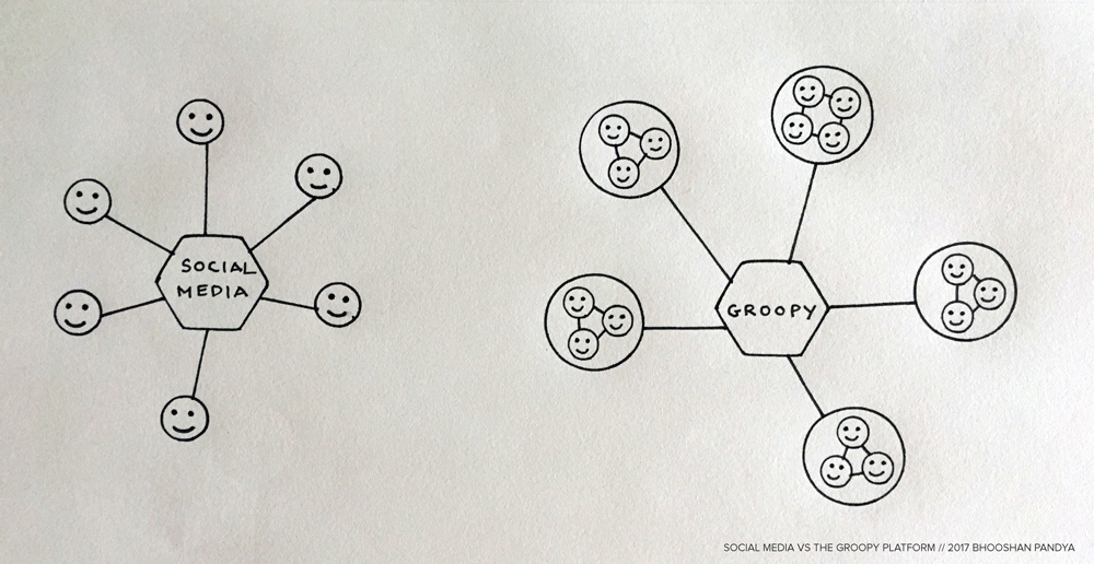
An overview of how Groopy differs from conventional Social Media.
Use-Case Scenario
Social media apps cater to an interactive communication model & the creation of associations for personal exchange of information. On the other hand, I aimed to bring cohorts and groups together on an enterprise platform through Groopy. For instance, an academic institution might attempt to bring its alumni together on a single platform for ease of professional networking and sharing of updates. Moreover, during my experience in exploring insights for the brand identity of Rotman’s Business Edge Alumni Network I realized that a brand could have a profound effect in assembling the graduates for professional networking, guidance, and other updates.
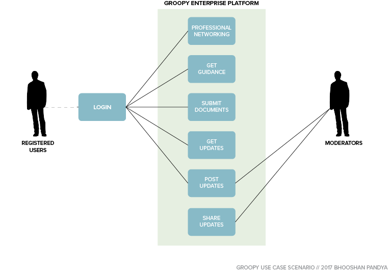
A Use-Case Scenario for Groopy.
The development of the use-case brought clarity into the different functions of the platform, and how it’d be finally integrated and linked with the user groups (personas).
Personas
Right at the onset when I was doing my user research for the Business Edge Alumni Network, I was simultaneously looking into the user groups who would be mostly interested in Groopy and focussed on building some personas. ‘Mike’ is a design graduate from a reputed college Toronto and wants professional guidance in connecting with past cohorts from his institution. He’s self-motivated but does not have the access to people from his alumni network and asking for introductions is time-consuming. He needs a platform that can allow him to glance at exactly the kind of individuals he needs to connect with and so on. On the other hand, ‘Melanie’ is an experienced team team leader at a call centre in Toronto who seeks to make her team efficient and productive. She’s been an ardent fan of Facebook and uses her personal account to connect with her team members regularly with schedules and so on. However, once the employee leaves she is burdened with removing the person from her friend’s list. Ever since she has started using Facebook for professional means she hasn’t posted a single personal update. She used the FB groups but found it tedious to keep up considering the higher attrition rate in her team.
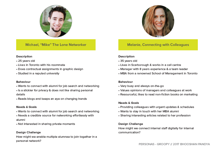
Personas developed as part of the user journey exercise for Groopy.
The proto-personas established a direct association with the motivations of the user group, the professional and personal choices they’d make helped me craft the user flows and ultimately the UI design.
User Flow
The culminating next step was to design the user flow which I considered a major exercise to link the goals to the tasks to ultimately decide the form and structure of the information architecture as well as and the design of the user-interfaces. The user flows also revealed certain other features to encourage user goals such as the ‘Kudos’.
It was necessary to have a deep down look into the interactions by designing the user flow so that each screen could be accounted for. Lastly, the user flows gave me a sense of the hierarchy of interactions, their flow, and so on. As always, I initially sketched rough drawings of the screen on paper before finalizing the UI screens.
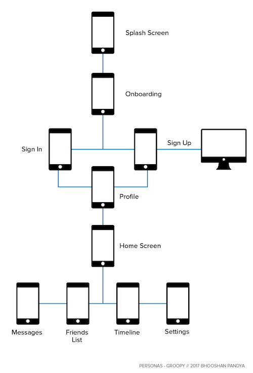
Groopy User Flow Diagram.
Screens
Continuing from the research which I’d done the time had come now to bring all that together into a satisfying & a delightful experience for the user. I designed the screens first connecting with the research I’d done and then brought the branding values into the designed screens. Since I was doing the branding exercise much later into the journey I had a hard time changing the screen designs in the last design phase! But altogether it was a delightful experience to bring the content and branding together into a single UI screen. My next goal is to make this app come alive through motion graphics to give viewers a sense of the app flows.
-
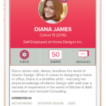
- Groopy – Profile
-
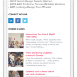
- Groopy – Profile (Scroll Down)
-
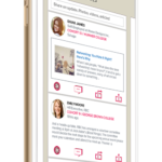
- Groopy – Index
In Conclusion
I followed a ‘waterfall’ design strategy in my attempt to understand the user goals. Beginning with my research for the Business Edge Alumni Network while developing their brand identity and then revisiting some of the user stories. I later spoke with a former call centre employee in how they kept in touch with the team leads. From the stories I started to develop the user personas & further refined my concept for the app. Furthermore, user flows and use cases gave me fuller insights into the creative process especially the number of screens to build and the features that the app would carry to help the design challenges of the respective personas. This culminated into the screen designs where I took a fresh look into aesthetics and the designing of graphics.
You can have a look at the screens and other details through an infographic on my portfolio website at www.bhooshan.net.