The Rotman School of Management in Toronto is home to some of the most prolific academic programs including the renowned MBA program. Nonetheless, Rotman also promotes an executive program called ‘Business Edge’ that is jointly funded by the Federal & the Ontario provincial government that assists internationally educated professionals (IEPs) to leverage their potential and take their careers to the next level in Canada. The fascinating thing about the Business Edge program (BE) is that it carries a vibrant mix of global professionals having wide-ranging experience in multiple industries (design is probably not one of them) which unquestionably makes the cohort involvement very stimulating. For a long time, there had been some chatter to float a community with the aim to collectively support and leverage their potential for helping achieve the aspirations of its members through mentorship & networking. Finally, on September 21, 2017, with the hard-work and undying zeal of some volunteers, the Business Edge Alumni Network came to fruition and was officially launched by Ontario’s Deputy Minister for Citizenship & Immigration Alexander Bezzina.
But there was another significant moment associated with the event which turned a new leaf in my career – the brand identity that I designed for the Business Edge Alumni Network was unveiled by the Deputy Minister.

With Ontario’s Deputy Minister Alexander Bezzina at the launch event.
The Research Begins
My first meeting with the marketing committee, entrusted with the job to oversee the logo design, was fruitful in grasping the objectives. Though the initial ideas revolved around the acronym B.E.A.N. (for Business Edge Alumni Network) all of us were unanimous in keeping away from this ‘low hanging fruit’ and looking at other concepts. The committee also handed me a list of brand adjectives or terms that they had collected during an exercise with the other committee members. It proved useful as a checklist in providing clues to sketch my concepts.
There were other challenges such as the inclusion of the Rotman branding into the logo since the program was incubated within the Rotman campus & it was known to attract talent based on that fact alone. While there was strong support in taking that route I was not relenting at all. I was of the opinion that the alumni network needed an identity that could stand on its own reputation, as I saw it the only element common between BE and Rotman was the shared campus space. Apart from that, Rotman was a bigger, more global brand with a well-known MBA program while BE was a functionally diverse program suited specifically for internationally educated professionals in leveraging their true potential for the Canadian workplace culture. However only to keep things in perspective I promised to revisit the idea of integrating the Rotman brand after I had finished designing the alumni network logo.
Without looking any further, I decided to connect to the very essence of the Business Edge program in order to build concepts, and that task was made a lot easier since I was part of a cohort myself and so understanding its culture & ethos wasn’t hard. After the meeting ended I was awash with so much inspiration that I decided to write a story in the subway on my way home to bring back the emotions of my journey to Canada! I believed this would reflect my feelings & resonate with what the cohorts at large endured as they made progress in their respective careers.
The Personal Story
While several metaphors crossed my mind as I was brainstorming the theme that stood out the most was about ‘relocation’ that is akin to the uprooting of a plant and sowing it in a different environment. I considered telling this personal story from the perspective of a ‘flower’ which had prospered in the abundant sunshine and soil of its home country.
The ‘nourishment’ I’d received enabled me to grow without any barriers! I never had to think about words like ‘cultural fit’ because it was my homeland. Just like many others in the program, I took a life-altering decision to relocate & come to Canada and that’s when things began to change. I thought my skills and experience would be enough to succeed in Canada but that wasn’t so. There was something which was missing and I needed to find it out before I’d ‘wilt’. Just then I discovered the Business Edge program at the Rotman School of Management which gave me a safe environment to grow. Like a plant that was brought back to life in a ‘greenhouse’, there was a place where I was given the necessary tools and skills in order to rediscover my roots & prosper in a new environment. Most importantly I found a place amongst a like-minded batch of people where it was OK to commit mistakes. I know that being part of a diverse community gives me the strength and the ultimate confidence of standing tall and reaching out for the skies again. In sunshine or snow, I know I have got the backing of the experienced alumni group to reach out in difficult times, and before long I was thriving again.
When I presented this story at the launch it was embraced with a resounding applause. Including, Ontario’s Deputy Minister Alexander Bezzina and Rotman’s Dean Tiff Macklem who congratulated me on stage for the presentation of the story and the brand identity design. This has been a proud moment and a high point in my long career as a designer.

On stage presenting the thought process behind the brand identity.

On stage presenting the thought process behind the brand identity.
Terms and Metaphors
As mentioned earlier, there were several metaphors which crossed my mind for exploring concepts:
- Connectedness
- Diversity
- Building a future
- Standing Together
- Staying Connected
- Support
- Growth
- Network/Networking
- Transform/Transformation
- Vibrant Community/Colourful
- Blooming (as a metaphor of growth)
It was also critical in understanding how shapes, colours, and form would justify a mark that’d represent the diverse community culture of this program. After all the symbol wasn’t representing a group alone but capturing the essence of the Business Edge Program and the Business Edge Alumni Network through the ideology of collectively standing tall, and of leveraging the connections of this diverse community to increase prosperity.
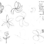
My earlier sketches were based on the Hibiscus flower which is found both in the tropical and cold regions with a slight variation – they’re not the same species. In reality, the hibiscus which is found in the regions around Ontario is the ‘hardy hibiscus’ variety which can survive the harsh winters. This insight was critical in designing the final mark and to drive home the point of survivability and transformation.
-
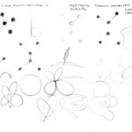
- Testing with the metaphor of ‘connectedness’.
-
- Petal swirls and other early concepts.
The Final Touches
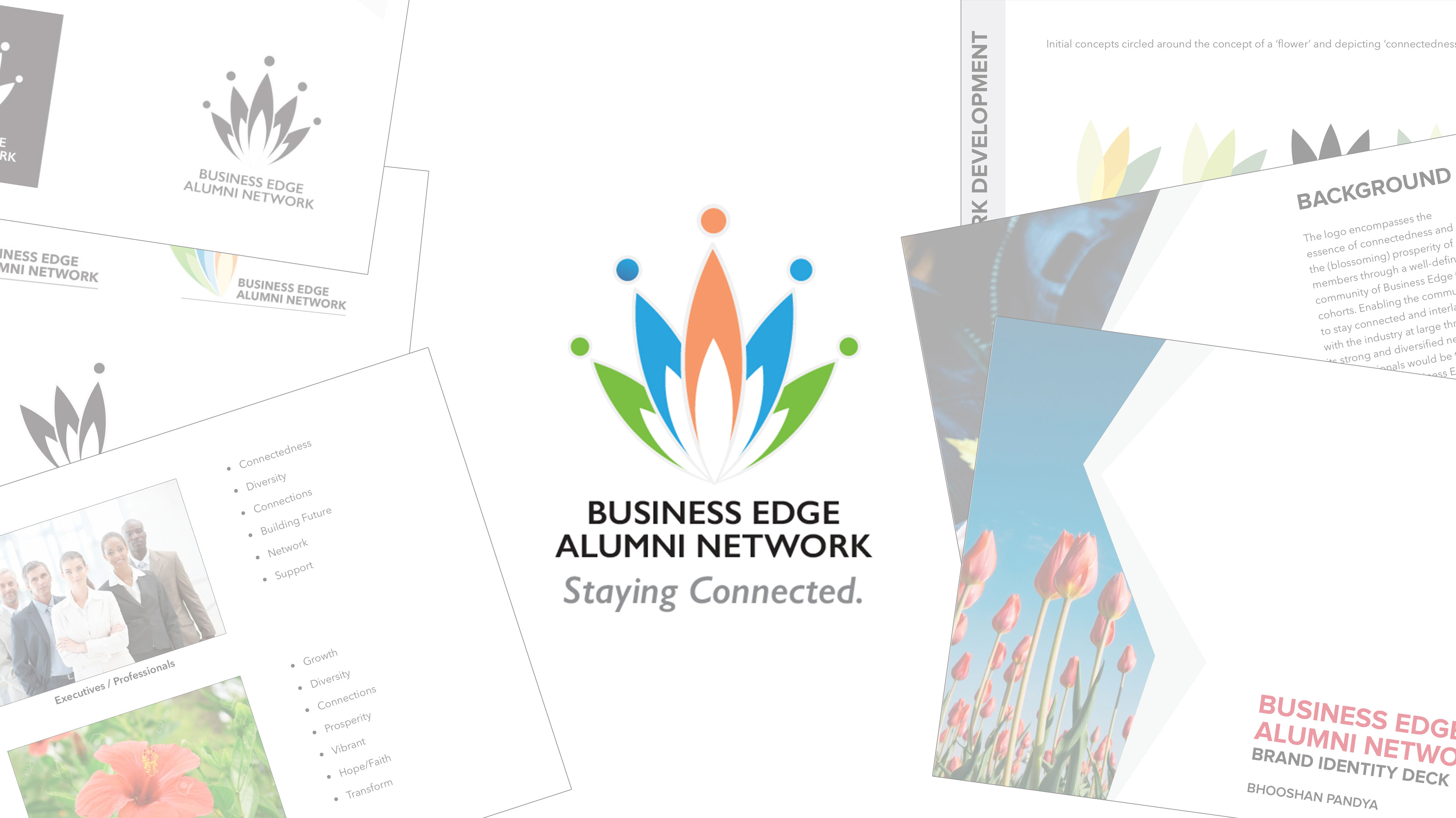
It began as an exercise with simple groups of ‘petals’ on a foundation depicting Business Edge as a fertile ground for growth and prosperity. The immediate reaction was to develop this idea further and to explore and enhance the geometry of the logo’s structure. I continued sketching and building the blocks on the theme of ‘connectedness’ and ‘prosperity’ giving further enhancements to the shape of the petals. The vibrant colours depict the diversity theme which has come to be recognized as the soul of the Business Edge program. Quite by chance, as I brought the geometric shapes together it created a negative space forming the shape of a lotus! This species of flower has several metaphors connected with struggle and survival, ultimately blooming in a pool of slush despite the odds.
BE Alumni Network_Logo Deck (designed by Bhooshan Pandya)
The colours had to be vibrant yet a balance had to be maintained in order to justify its goal. I chose flat colours as opposed to gradients, but technically a flatter range of hues which also allowed me to nudge closer to the corporate branding style of the Rotman School of Management.
I also decided to apply the Golden Ratio rectangles on the brand identity for the first time and see how the creation has matched up to the Fibonacci Sequence. This turned out to be a perfect exercise to prove a structural balance in the entire visual system.
For the launch event, I presented the thought process through a series of illustrations depicting the ‘flower’ story.
BE Alumni Logo Presentation (draft 2.0 by Bhooshan Pandya)
Some Lessons Learned
From a personal standpoint this exercise has proved yet again that whether it’s a digital product (a subset of UX) or a brand identity there’s always a user’s story to be seen from an individual’s perspective – a narrative which captures the myriad emotions that need to be synthesized by the designer in order to esoterically form a graphical identity system. In other words, practicing empathy. This design of an identity – whether it’s a symbol or an interactive product, becomes an apparatus with which end-users learn to identify themselves. One of the other things which I’ve learned over the years is that it’s better to stay away from the first flashes of creativity and explore numerous ideas, not to stick to one stream of thought and get the pencil to paper for synthesizing different concepts. For instance, when I was brainstorming, the ‘bean’ ( an acronym for ‘Business Edge Alumni Network’) came across as one of the metaphors which depict the beginning of a life form. It would have made my job a lot easier to build upon this concept but I relented and today when I look back at the results I’m glad that I made that call!
I’m very hopeful that the Business Edge Alumni Network with its diverse community, past as well as prospective, would embrace the ‘flower’ mark and assign it the significance that it truly deserves as they embark on this endeavour of timeless proportions.
Stay Connected!