It’s no secret that I’m a film buff, and I especially adore the animated features (Hey, Pixar!! I’m looking at you) which are handcrafted and capture even a child’s imagination. Even Apple hasn’t remained immune to the animation culture in celebrating the 2018 holiday season. Anyway, if you love handcrafted characters from animated classics then “the Bird” wouldn’t have missed your eyes during movie times! This beautifully scripted and hand-painted intro appears before TV shows and movies such as Gladiator (2000) and in recent times Bladerunner 2049 (2016) and Earthquake Bird (2019).
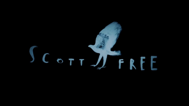
It’s notably elegant for its unique style and use of subtle colours, but also the morphing technique incorporating the use of tailored canvas art with traditional cell animation artistry. No marks for guessing that I’m talking about the exuberant intro animation for the movie production house Scott Free Productions. This versatile production studio was co-founded by the legendary filmmaker, Ridley Scott and his brother, Tony Scott in the UK in 1995. But it wasn’t until 1998 that “The Bird” logo became synonymous with Scott Free’s productions.
This short 20-sec something intro — famously referred to as, “The Bird”, “Man Into Bird”, or “Shapeshifting Bird”, is also used in different abridged forms, was designed by Italian artist, animator, and illustrator, Gianluigi Toccafondo, as a series of individual paintings. The individual artwork pieces were then photographed and made into a single feature. It reminds me of the flipbook technique containing a series of individual drawings on single pages, and appear to move when the pages are flipped in quick succession. It’s the first view that a beginner in animation can expect to have to understand its nuanced semantics.
Try moving the right-hand slider as swiftly as you can progressing one image at a time, to get a feel of a flipbook. In short, that’s how this intro logo was conceived by the designer! It’s definitely creative.
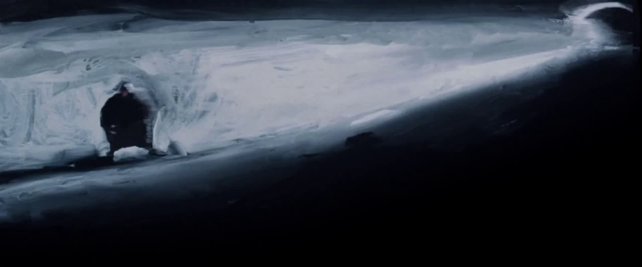
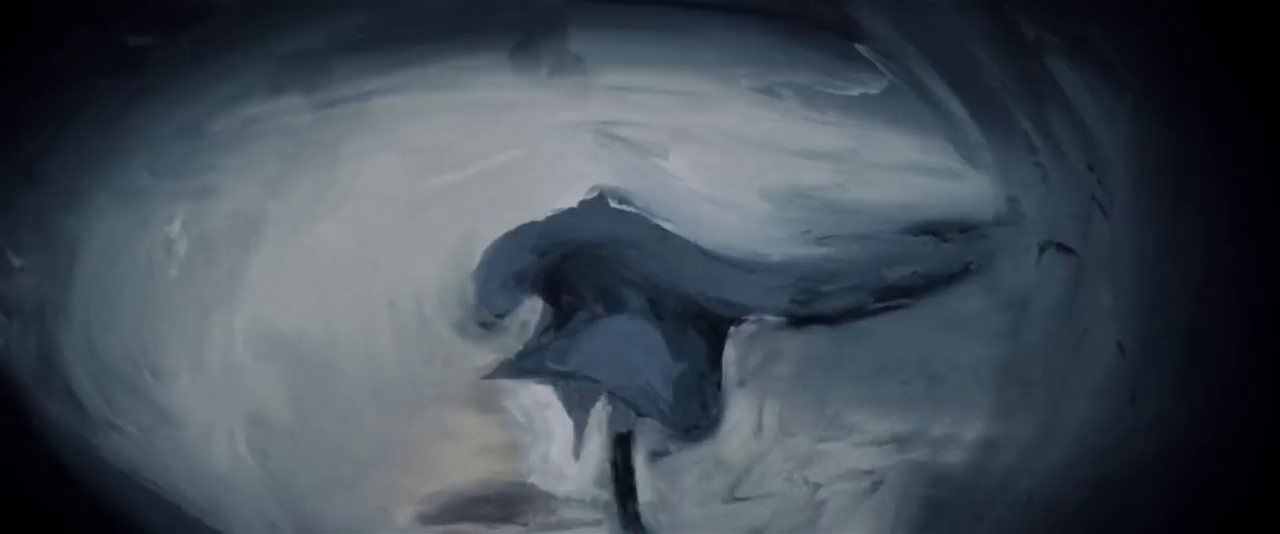
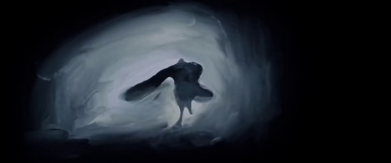
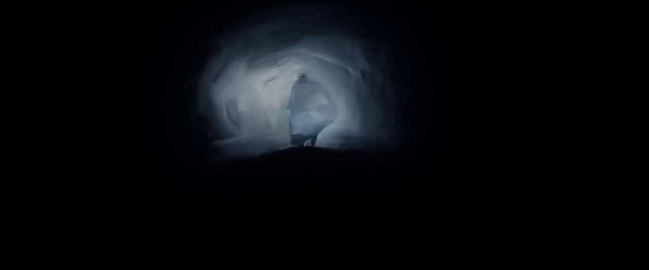
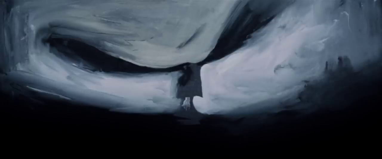
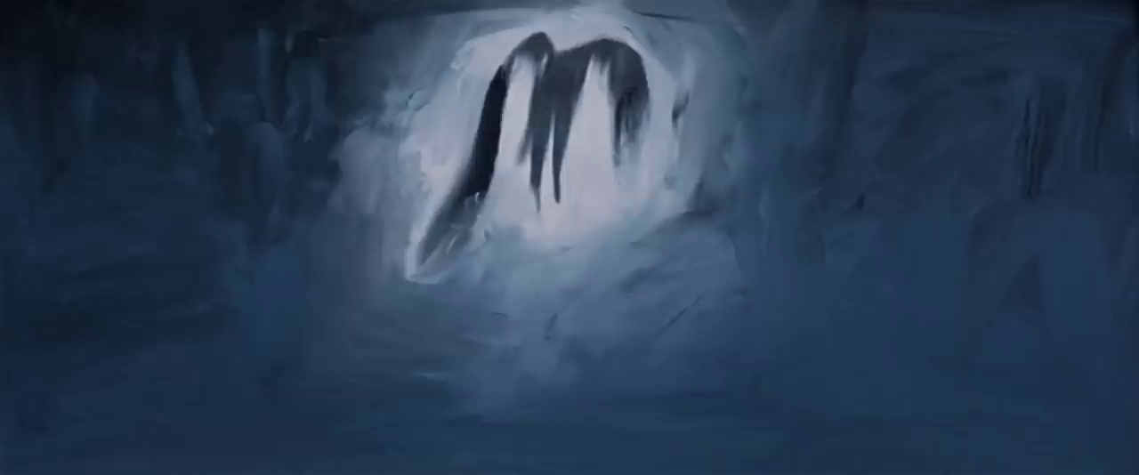
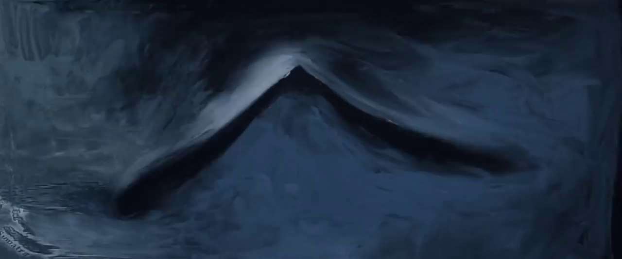
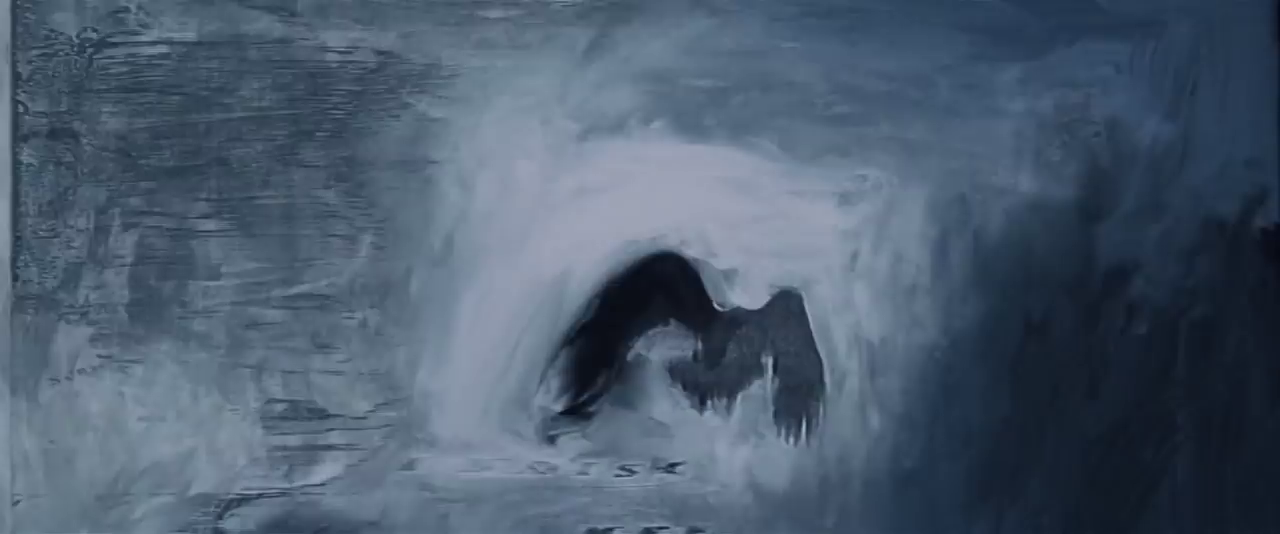
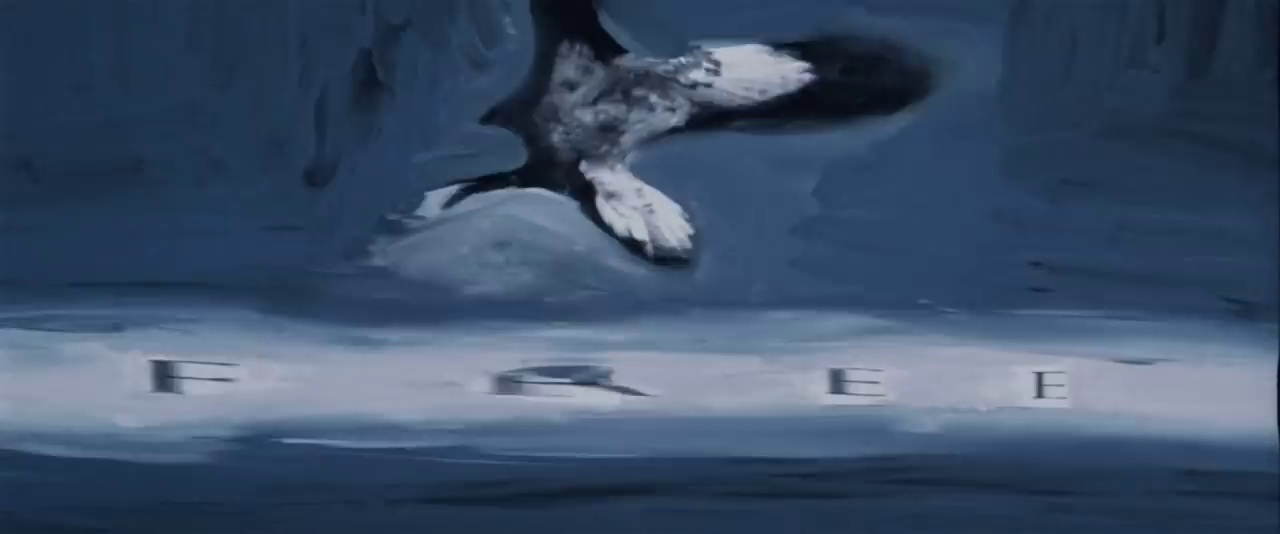
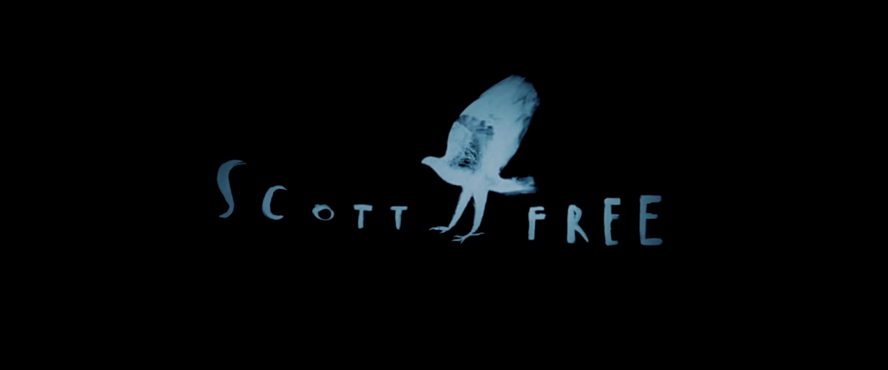
On a black background, we see a man clad in monk-style clothing walking as a white light illuminates him. He lights up a match, and a burst of light appears next to him. We then cut to another shot of the man, as he runs away against a yellow spotlight. His arms transform into wings, and he turns into a bird that flies across a multicolored background. The text “SCOTT FREE”, in the same font as before, slide in underneath the bird before transforming into a weird font. The bird becomes a blue silhouette version, and the logo becomes still on a black background.
Scott Free Productions – Closinglogos.com


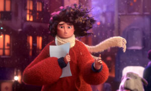 It’s an account through the eyes of a lonesome lass with a secret penchant for creativity and her companion dog as the only one who knows & values her innate talent and who eventually albeit creatively, of course, forces her to come out of her hiding. In all this, I was astonished to see how Apple has taken fancy to Pixar-inspired storytelling for the first time! The past commercials from Apple have resorted to numerous graphical treatments in making visually stylised product campaigns though animation not being a prominent theme on that list so far. While the tagline ‘Share Your Gifts’ is a beautiful wordplay for acknowledging not just the sentiment of giving in the festive season but also for energising & sharing creative material using the power of Apple’s great products. A company that has always championed the cause of the creative arts community worldwide yet again communicating its unequivocal stand with this fabulous ad, and dare I say, the folks at Pixar would be so pleased to see their artistic journey as an inspiration for the design of this spot. Also, there’s a moral for everyone that creativity is yearning to come to life only if you could use your artful imagination, so go ahead, surprise yourself and your peers. “Don’t hide” and dream on!