This holiday interval provided an enriching creative opportunity, and one, which has resulted in an excellent culmination to my 2017. I met with the Founder-CEO of Kalo Healthcare Solutions, a Toronto-based company and involved in digital healthcare consulting for enterprise solutions, and over a coffee, it was decided that I would create a brand identity system for them. After following up with some conversations, I decided to build a branding concept that conveys the message of Kalo’s assiduous focus on its stakeholders, large and small, to transform into digital healthcare by offering both strategic consultation and delivery services. This is a story of the how the brand identity design came into being.
Developing A Narrative
From the beginning, I felt I was dealing with ambiguous data with challenges in forming a right approach for developing the brand identity. So I resorted to a strategy similar to some of the other identities I have designed in which I had to conceive a series of ideas through storytelling in order to get to a metaphorical context for the brand. On the other hand, since the brand of ‘Kalo’ was fairly new I saw ample opportunity to envision a unique brand styling not influenced by its past. I was aiming to connect with a brand value in not just building a mark/symbol with type and colour schema but also depict Kalo’s mission and vision through a story. Since Kalo was a new company, the limited knowledge about its organizational structure and its lack of vision/mission proved to be a blessing, in that I wasn’t constrained in my visualization of what the company could or could not bring to this world. I had a brief which was limited in its information yet brimming with critical touch-points which I could develop into tangible concepts. I was told that ’Kalo’ is a Greek term for ‘good’, and I parked that thought for now. Instead of taking the simple route I deliberately avoided expanding that keyword into concepts and challenged myself to think further and into Greek mythology and culture. I also consciously avoided conceptualizing around the typography, although the alphabet ‘K’ did latch onto my visualization. But in terms of exploring the virtues further, what else could a company named ‘Kalo’ signify?
Advancing this logic I developed various connotations to broaden my sense and vision about how Kalo would be perceived by its clientele. As opposed to sketching my own preassumptions, I wrote a narrative envisioning Kalo Healthcare Solutions’ brand value and to enable a concrete design approach. Through this exercise I came up with the following brief for my next concept:
Kalo Healthcare Solutions is a healthcare consulting company, believing in producing interconnected and far-reaching digital solutions. ‘Kalo’ is a Greek term for ‘goodness’. The logo is a reflection of the interconnected nature of tech consulting in delivering a well-balanced strategy. Kalo’s mission is to be at the forefront healthcare consulting in helping enterprise corporations by bringing digital transformation solutions to its end-users. The ethos of ’goodness’, ‘support’, and ’connectedness’ are ingrained within Kalo’s DNA which reflect strongly in its brand identity.
Initial Visual Concepts
From the narrative, I was able to drill down to a few metaphorical keywords to be able to make sense of the brand value which would eventually culminate into a brand identity. I preferred only those keywords or connotations which were likely related to the brand value. These were the keywords that I shortlisted:
- Connectedness
- DNA
- Building Future
- Network
- Pairing
- Growth
- Interconnectedness
- Network
- Collaboration
- Support
- Transform
- Digital
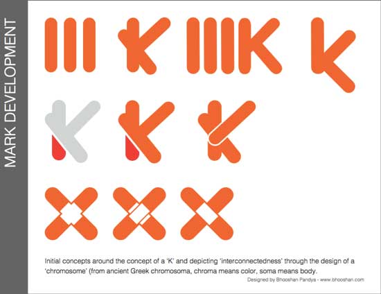
The keywords helped me achieve a degree of deeper understanding of the brand. Amongst the list, the words, ‘connectedness’, ‘interconnectedness’, and ‘building future’, resonated strongly with my logic in relation to the narrative. I had also thought deeply of the word ‘DNA’ from the list and that invariably led me to think about ‘chromosomes’, it’s a term which also originates from the Greek language. In a way, I had come full circle, starting the term ‘Kalo’ and now ‘chromosome’ both related to Greek etymology. Carrying this common view forward, I came up with some initial visual concepts from my second phase exercise.
Moving Closer To The Mark
Through writing a narrative and then making a list of keywords, I had come close to a definite concept, however, my priority now was to connect these final pieces of creativity. I had already worked around the concept of ‘chromosome’ and ‘DNA’ and it was time to connect that with a new keyword of ‘interconnectedness’.
Insofar as any IT / consulting business is concerned it relies heavily on research data and the data-analysis for any consultant to predict an outcome and decide on a precise strategy. The data is obtained from several quarters which is not just limited to sales, marketing, and so on. The consultant is the pivot in connecting these factions together and this precisely defines the ‘interconnectedness’ of a consulting profession. This viewpoint was also clearly defined in the narrative on Kalo.
I had already worked on the ‘chromosome’ concept which I began merging with the theme of ‘interconnectedness’. And I was amazed at the outcome myself.
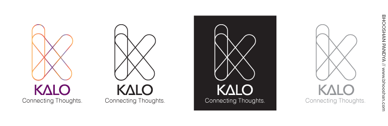
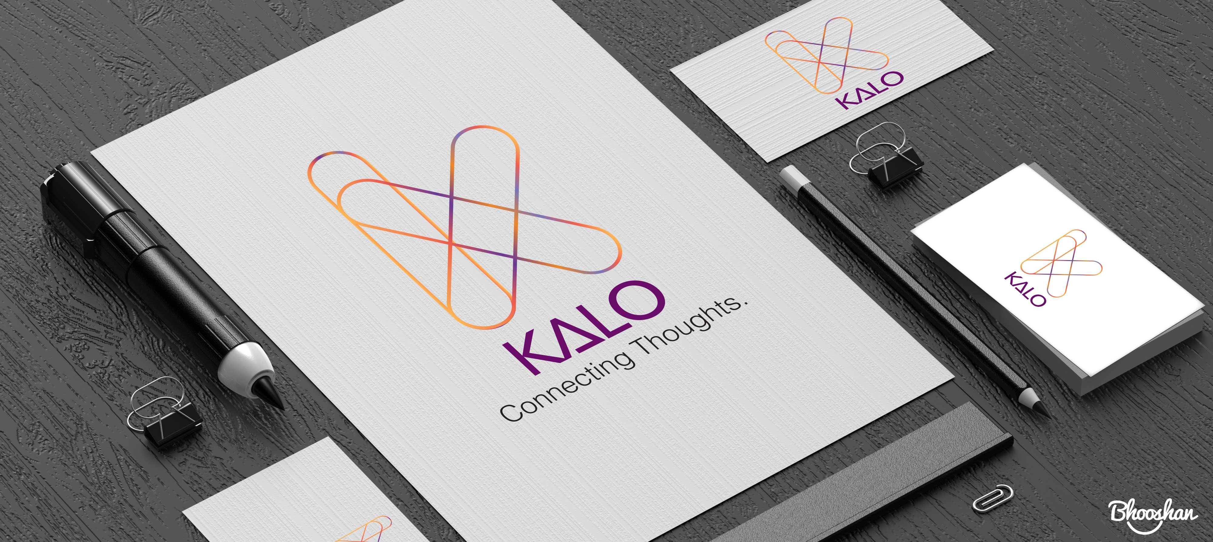
The Kalo ‘Chromosome’ Mark and the Typography
In Conclusion
In hindsight, I realize that taking a different approach and not allowing other influences or connotations to interfere with my conceptual phase thinking proved quite advantageous. I continued to focus on the narrative and imagining the myriad possibilities that ’Kalo’ as a company could traverse going into the digital future which helped me to write my narrative outlining its goals. On the final mark, I purposely omitted the name of the company because I foresee ‘Kalo’ to survive beyond its ‘healthcare’ vision down the line. The colours I selected were distinctly vibrant to reflect the energetic individuality of the healthcare sector. Bottomline, I aim to build brands with deeper emotional connects, not just marks or symbols, and this exercise would prove that sufficiently.
Continuing with the Greek conceptualizations I also introduced a 𝝙 in the ‘KALO’ to further reinforce the brand value. I thought it made the outcome more meaningful because corresponding to the ancient Greek symbology, the alphabet of 𝝙 (Delta) signifies a ‘power’ or ‘force’ which constructs or creates. So even without the ‘chromosome’ mark the logo still made adequate sense for the audience and for the company’s vision.
I could say, that we are already in the midst of a challenging digital transformation era where global economies are experiencing a paradigm shift. The traditional lines of businesses are being redrawn which is not only altering the way customers experience products but also how they perceive a brand’s value, and that perception is also consistently evolving. In that sense, I hope that KALO’s ‘Connecting Thoughts’ theme would ignite the company’s mission of building an everlasting organic experience for its customers through digital technology.
As I mentioned before, this was a great creative exercise on several fronts, and most notably, the experience turned out to be pleasant and the outcome fruitful because of Peter who handed me complete control over the design without letting any pre-determined ideas interfere with my creative thinking. He just had to give me a short background on Kalo and the rest was history. I really wish to thank Peter for his support and I am confident of Kalo’s brighter tomorrow.
“Who would have thought that a few quick and casual conversations could turn into something with such meaning. That is what the experience was like with Bhooshan. The process was natural and effortless. The result was professional with deep thought. Bhooshan was able to capture all the ethos of our company and roll it up into a simple logo that defines our brand. Very pleased with the experience and would highly recommend. Thank you Bhooshan!” – Peter Tsekareas, Founder and CEO of Kalo Healthcare Solutions