google

Cleaning Up My Calendar And The Chaos

I signed up for a 1-hour webinar for creating a Business Model Canvas in November 2015 and I accepted a calendar (.iCal) invite for the event from my email account. It’s always convenient as a reminder with the event details now etched for eternity in my Calendar on Mac and Google. Soon after, the organizer wrote back saying there was a mistake from their side. The platform used to send the invites “wasn’t meeting the standards for a smooth broadcast”. I thought how serious could this be. My calendar displayed some unidentified entries, such as meeting invites from John Doe, also the host of this webinar, and I deleted them steadfastly. It was chaotic and I falsely thought that my tragedy has ended here.

I’m an infrequent Calendar user on Mac. But ever since this November incident, I started receiving a server connection error every time I would open it. I only realized today that this silly server mishap had rained a deluge of personal entries from John Doe’s calendar onto my calendar entries, right back up to 2011! Apart from the many recurring meetings, there was a court appearance for a traffic offense, some haircut schedules, details on flights, itineraries, and hotel stays, dinner meetings with executives, and more. Not to mention the calendar displayed time and place particulars as well. Much embarrassing as it was for me to know such intimate information from John’s personal schedule, he would be horrified to learn about this rather bizarre leak to more than 20 participants of this seminar!

I began a clean-up operation lasting about an hour, painstakingly glancing and deleting every single entry I could find until 2011 so far. Unfortunately, some of the deleted entries would have sent email notifications causing inconvenience to its participants but it doesn’t matter to me. My calendar was mutilated and my privacy has been wrecked and it led to unimaginable turmoil, thanks to some web platform broadcast which went awry. Now I only hope that John Doe doesn’t have a long-winded career and his entries don’t go far back in time. This incident has taught me an invaluable lesson, that convenience is sometimes costly.

Grammarly

Here’s How You Can Check Your Language Now

What could be apter than using an app to check your language? Just as the ubiquitous spell check became a formidable innovation in the Word doc era, verifying your language has become a necessity for bloggers, serious writers, and students today. Personally, I need to frame my thoughts correctly to sound better in English, and always looking to convey the right meaning but there’s little help to verify what I have written. So while I was watching YouTube an ad caught my attention, and I thought let’s give Grammarly a try. I installed the Mac app (v1.4.20) and here’s my take.

Apart from the concept, my full credit goes to the designer(s) and the developer(s) working behind the curtains on creating the minimalist user-interface. Once you open the app you just cannot resist starting to type a few sentences to test it out (mine ended up becoming a blog post). Though I wasn’t confident earlier on using this app, I was anxious to lose data while moving from the ‘Advanced Issues’ tab back to my writing, but it was seamless. Moreover, if you still fear being hunted down by the ‘grammar nazis’ there’s a handy Chrome extension available on the Web Store to help you check your language in emails, social media accounts, and other online docs. It was smooth going moving to and from my write-up on WordPress Blog using this extension while correcting the language in a separate window.

Grammarly has the potential to become the next Evernote for writers, especially useful for students if they open up their premium features to free subscribers, such as checking for plagiarism and improving their word choice which is important to make posts and articles concise and lucid. You can also export your write-up in .txt format though that isn’t a big deal when you can easily copy/paste into a text editor and continue editing. Overall it seems that the approach is to give a hassle free text-editing experience with bare minimum features, even excluding the routine print option for that matter. So for those who would love to check on their language quick and easy, get Grammarly today.

Design Case Against Gmail Tabs

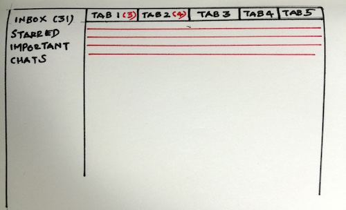
Gmail Tabs was meant to handle email clutter in the primary inbox and optimize the email experience. Surely enough it was an exciting news for Gmail fans, and before I knew I had activated the feature on my account. So now I had five tabs (or inboxes) in Gmail where emails from different sources were automatically redirected into Primary, Social, Promotions, Updates or Forums tabs. You could also drag an email to any of the tabs, so that Gmail could recognize and deliver future emails to its respective inbox tab. And I was happy with this arrangement until I realized it had started to cause me inconvenience in managing different tabs or inboxes at the same. Using the Gmail app on iOS correspondingly was even more annoying because it increased my time (tap ratio) to reach specific emails and take action. As time went by I cared less about prioritizing my emails and more about organizing my emails. In fact I lost complete control over my emails and conversations and decided to do something about it.

There are email updates such as newsletters and account details, new sign ups, login notifications, verify email address, et al., and social media messages such as Twitter and Facebook notifications and then Spam, they all could be deleted or preserved (labeled appropriately and/or Archived) depending upon the value of the information.

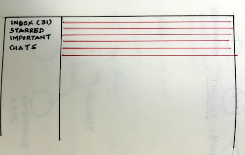
In that sense Gmail Tabs brought a behavioural change in email interaction. There was a logical movement of the eye (scanning) in the traditional email list navigation model following a Receive > Read > Act > Delete/Preserve task flow. In other words conversations were easily identifiable through a comprehensive visible list of messages.

Traditional Inbox

Traditional Inbox with Email Listing (in red)

When Gmail Tabs introduced several inboxes within a large mailbox scanning became a matter of choice. And since each tab represented an inbox with emails delivered in volume at the same time, the focus shifted to reading emails in the Primary inbox (since they tended to represent real email senders), while taking it easy on the rest of the tabs. So when tabs presented multiple choices to the user it inhibited the person to make a decision.

Priority Inbox Feature

Gmail’s inbox feature with tabs (& unread emails)

Here’s why I believe Gmail Tabs was a design failure over the traditional Inbox design. This feature by its inherent network of tabs hid information and persuaded users to ignore emails and not motivate them for further action. For example receiving email in any of the tabs other than the Primary mailbox would either be read or ignored but never deleted. And storing all those trivial emails not only bloated my Gmail account it also overshadowed important conversations and added to the clutter.

For me nothing works like the original inbox mail listing feature now that I’m using it again. I can now control whether emails stay or go to the Bin the minute I receive them. The list design pattern provides early clues on information and doesn’t afford for conversations to hide behind tabs. Now that the original Inbox listing is back for me I noticed a ton of unread emails. So excuse me, while I clear this email mess!