Gmail Tabs was meant to handle email clutter in the primary inbox and optimize the email experience. Surely enough it was an exciting news for Gmail fans, and before I knew I had activated the feature on my account. So now I had five tabs (or inboxes) in Gmail where emails from different sources were automatically redirected into Primary, Social, Promotions, Updates or Forums tabs. You could also drag an email to any of the tabs, so that Gmail could recognize and deliver future emails to its respective inbox tab. And I was happy with this arrangement until I realized it had started to cause me inconvenience in managing different tabs or inboxes at the same. Using the Gmail app on iOS correspondingly was even more annoying because it increased my time (tap ratio) to reach specific emails and take action. As time went by I cared less about prioritizing my emails and more about organizing my emails. In fact I lost complete control over my emails and conversations and decided to do something about it.
There are email updates such as newsletters and account details, new sign ups, login notifications, verify email address, et al., and social media messages such as Twitter and Facebook notifications and then Spam, they all could be deleted or preserved (labeled appropriately and/or Archived) depending upon the value of the information.
In that sense Gmail Tabs brought a behavioural change in email interaction. There was a logical movement of the eye (scanning) in the traditional email list navigation model following a Receive > Read > Act > Delete/Preserve task flow. In other words conversations were easily identifiable through a comprehensive visible list of messages.
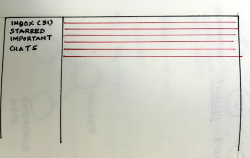
Traditional Inbox with Email Listing (in red)
When Gmail Tabs introduced several inboxes within a large mailbox scanning became a matter of choice. And since each tab represented an inbox with emails delivered in volume at the same time, the focus shifted to reading emails in the Primary inbox (since they tended to represent real email senders), while taking it easy on the rest of the tabs. So when tabs presented multiple choices to the user it inhibited the person to make a decision.
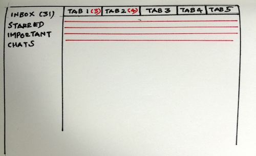
Gmail’s inbox feature with tabs (& unread emails)
Here’s why I believe Gmail Tabs was a design failure over the traditional Inbox design. This feature by its inherent network of tabs hid information and persuaded users to ignore emails and not motivate them for further action. For example receiving email in any of the tabs other than the Primary mailbox would either be read or ignored but never deleted. And storing all those trivial emails not only bloated my Gmail account it also overshadowed important conversations and added to the clutter.
For me nothing works like the original inbox mail listing feature now that I’m using it again. I can now control whether emails stay or go to the Bin the minute I receive them. The list design pattern provides early clues on information and doesn’t afford for conversations to hide behind tabs. Now that the original Inbox listing is back for me I noticed a ton of unread emails. So excuse me, while I clear this email mess!