Imagine a scenario, in which you had a meeting at this elegant downtown office building and you were desperately seeking the washroom before the meeting started. You scampered looking for washroom signs but couldn’t find it. Finally, you gave up and humbly approached the reception for directions, and felt like a jerk! Because the washroom was right next to an area you passed moments ago. So what went wrong then and why couldn’t you find the washroom if it was that easy? The answer is the architecture design didn’t reveal itself completely and left you confused. The sign for the men’s loo was visible but you missed it in your focused approach towards reaching your goal, that is quite common. You were very confident in reaching your goal but your search ended miserably and you felt embarrassed. The task of finding information online can look even more daunting without a soul to ask for ‘directions’ and customers surrender to their frustration turning away from that “annoying” website forever.
Content is often ignored at the cost of graphics, and while effective presentation techniques are imperative in today’s digitized world leading websites skillfully engineer information through a maze of pictures and graphics to bring the user to their logical destination. In the noise around designing successful UX, we sometimes overlook the importance of content. And the success of a successful content strategy, be it a website or Intranet, depends strongly on the robustness of its information architecture (IA). The goal for content strategists is not just to create meaningful content but to also lead the users to it. If you’re designing for online applications, you live by the mantra ‘if it’s not seen, it doesn’t exist’!
The Definition of Information Architecture
User-interfaces have the obligation to lead users to their goals and make that (sometimes arduous) task worthwhile. One of the design criterions for outstanding UIs is not how flashy it appears or if the microinteractions have been duly exercised, but how the relevant ‘hooks’ and labels have been drawn to prevent distracting the users from achieving their goals. When you reach a milestone in your journey for finding information (hopefully without bumps), the information architecture design registers a big win! To put matters into perspective, the purpose of an information architecture is to inform and lead users towards their goal, give clues about their location on the site, give indications about the site’s content and what they should expect, and empower users to navigate and commit actions without fear of losing track of their goals. The implementation of UI trends or techniques is beyond the purview of this article.
The Components of Information Architecture
For a rewarding experience, it’s critical to understand the user group needs while associating their objectives to create a meaningful content strategy. In their book Information Architecture for the World Wide Web, Lou Rosenfeld and Peter Morville categorize information architecture into 4 major components:
- Organization systems – presenting the site’s information in a variety of ways, such as content categories, etc.
- Navigation systems – Helping users to move through the information maze.
- Search systems – Allowing users to search the content of the website. This is especially useful when the user is lost.
- Labelling systems – Describing the categories, options, and links in a language that is meaningful to the users and helps them in decision making.
Let’s look at the organization of content on the Government of Canada site. For our discussion, I have marked some areas yellow for better representation.
")
The ‘Persistent Top Navbar’ has demarcated categories of content areas appropriately labelled to give readers a sense of the imminent content (provide ‘information scent’). It also depicts the nature of the business to the newcomer who may have wandered unknowingly. The ‘Search Function’ helps the users connect logically with information when they are lost on the site. The logo or branding component acts as an exit to the home page when the interaction has failed to address users needs and the user wants to restart his/her search afresh.
Due to its inherent value for the website and indeed the users, the logo, the ‘Persistent Top Navbar’ and the ‘Search Function’ remain static on all the pages and are always placed on the top. The ‘Breadcrumb’ navigation provides an indication of the user’s location (and the current page too) in relation to the site hierarchy. The descriptive ‘Page Title’ is a confirmation of the visible information or the ‘primary content’ on the page even before the user dives deeper into the detail. The primary content is further categorized into smaller bits in the ‘Persistent Left Navbar’. Beyond this, as we continue to scroll downwards the criticality of the content in context with user needs begins to diminish. The footer (not seen in the pic) typically contains information that is more likely discounted by the user in favour of achieving the immediate goals. The most important portions of the content are thus organized at the top, or the first fold of the page template.
The organization of the Government of Canada website content with the information architecture serves as a direct response to questions related to cognitive load, such as, where am I? (location), how do I navigate to other links? (interaction), what’s happening here? (content, information), etc. The information architecture, in this case, has helped in reducing cognitive load thus making the website ‘ user-friendly’.
Content which is categorized on a page also makes it meaningful. The BBC’s ‘On This Day’ website is beautifully divided into main content and sub-content areas. In my review of the page which speaks about the launch of the Soviet space station ‘Mir’, I categorized the page content into 4 parts. This is also how I perceived my own eye movement on the page while foraging for content.
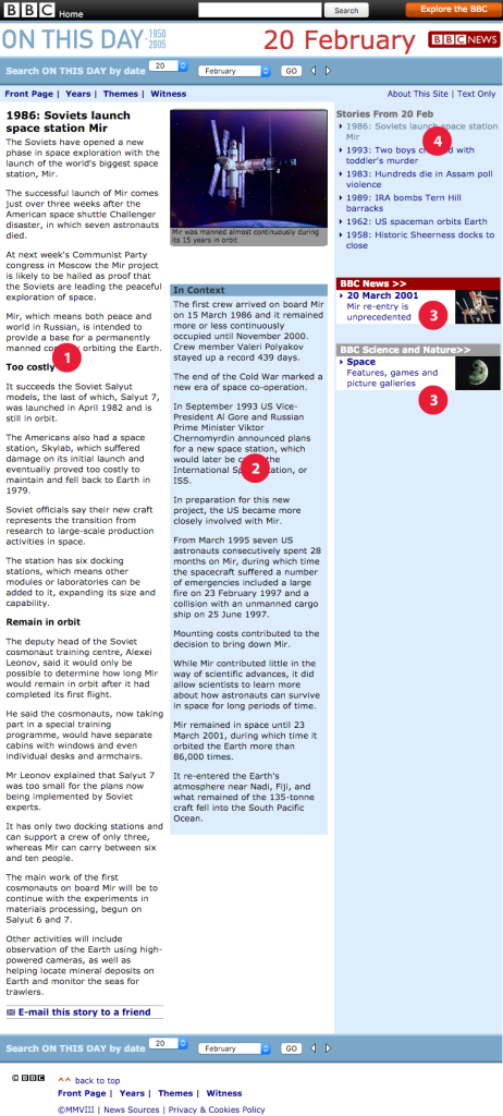
- The primary content area speaks about the happenings of February 20. This article, in particular, happens to be on the launch of the Soviet space station ‘Mir’ on February 20, 1986. A hook had already been provided on the home page for me to visit this area.
- Secondary content – still on the topic of ‘Mir’, how about giving out details on what else happened with it later. What happened after the dissolution of the Soviet Union in the 90s? What was the role of the US? This is mainly to create enough interest for the reader to stay on the page. Notice the hooks.
- Tertiary content – content that’s associated with the secondary content and creates interest about the post-90s era prominence for ‘Mir’. The ‘hooks’ in this case are in the form of synopsis on ‘Mir’. Since enough curiosity has been generated in the previous 2 stages the reader will be inclined to move to other parts of the website.
- Related links – subsequently on the topic of February 20, how about providing the user more relevant ‘hooks’ on February 20 during that era. Wouldn’t you want to know what happened on this day in 1993? The interesting bits and pieces of information from the previous stages and the synopsis are enough for the reader to take this virtual ‘bait’.
Bottomline, it’s not merely about creating meaningful content but organizing it as well. In fact, it’s the organization which brings purpose to the content and makes it meaningful for its readers.
The Constituents of Information Architecture
Users, context and content are the 3 major constituents of an information architecture design and the correlation between them can be seen in the Venn diagram here:
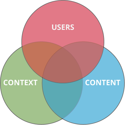
Having a deeper sense of the business context of the application (website or Intranet) to be designed, and co-relate with the content which either exists or needs to be generated. Subsequently, it’s highly conducive for studying the demographics by working alongside the users to draw mental models which help in designing a content strategy for your application or site. A ‘mental model’ is how users individually perceive the world around them.
- Users – There are marked differences in customer preferences and behaviours when moving from the physical world to digital (mental model). Hence when users are willing to spend time (visits) or money (purchase), knowing about their preferences becomes crucial in structuring the content according to their needs and desires. On the BBC website, the user (or reader) would be a knowledge seeker and the interaction confirms that belief. The preferable ‘need’ was to get answers about February 20 but in the journey, the ‘desired’ outcome was more than what the readers had bargained for.
- Content – “Content” is broadly defined as documents, applications, services, schema, and metadata that people need to use or find on your site. I consider “content” as only textual information, since text drives the meaning for the rest of the online communication, through graphics, visuals, or other media elements. Each site or application throws a blend of content, that which is unique to the organization and defines the nature of its relationship with its audience.
- Context – Each individual application – be it a website or an Intranet, reflects the culture of the organization and exists within the organizational context of a particular business. Information Architects need to capture the unique qualities of the institutions to design a unique design language. The context makes the application stand apart from the competition. The context is an important facet of information architecture in defining the size and organization (structure) of the content as well.
Conclusion
An effective information architecture design shouldn’t be considered as an alternative. The costs of not having a desirable experience for the user could be devastating for the business in current times. Invariably information architecture should not be misconstrued as just structuring of the content. It’s about designing spaces that connect the audience with the philosophy of the business, rather it’s also about the individuality of that space itself. Data should be structured and designed cohesively by gaining insights into user preferences, connecting it with the context of the business, and driving a wholesome experience to retain the interest of the audience.
Further Reading & Acknowledgements:
- Featured Image – courtesy of Gary Barber (Flickr/Some Rights Reserved) Link: Flickr Photo Page
- Information Architecture Basics – Usability.gov. Link to Information Architecture Basics
- Information Architecture for the World Wide Web, 3rd Edition: Designing Large-Scale Web Sites by Peter Morville, Louis Rosenfeld. Link: Shop O’Reilly Media