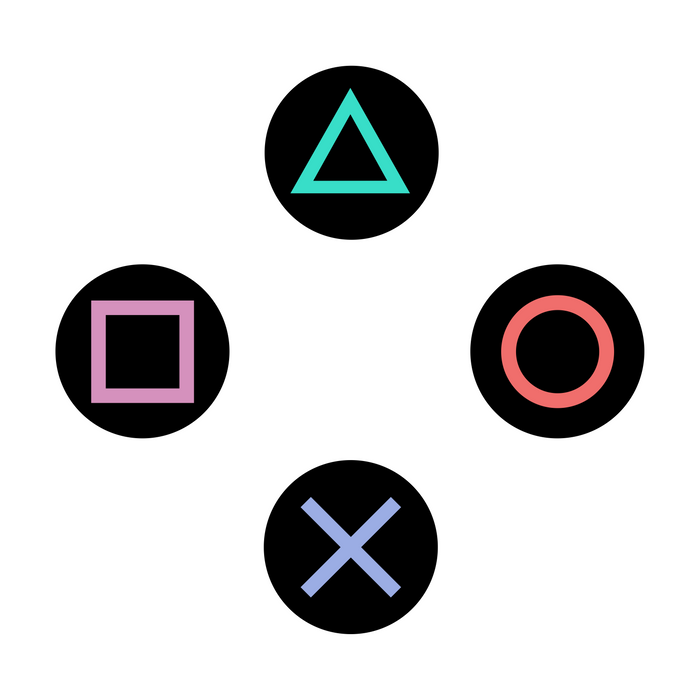
If you’ve been a kind of a gamer, you can’t miss out on those 4 colourful ubiquitous signs of the PlayStation controller. On the other hand, there are chances that you completely miss their significance beyond using them as primary controls for interacting with the game environment. PlayStation logo and product designer Teiyu Goto explains the real reason behind choosing symbols over alphabets, which previous generation consoles were already doing, and it makes total sense:
Other game companies at the time assigned alphabet letters or colors to the buttons. We wanted something simple to remember, which is why we went with icons or symbols, and I came up with the triangle-circle-X-square combination immediately afterward. I gave each symbol a meaning and a color. The triangle refers to viewpoint; I had it represent one’s head or direction and made it green. Square refers to a piece of paper; I had it represent menus or documents and made it pink. The circle and X represent ‘yes’ or ‘no’ decision-making and I made them red and blue respectively. People thought those colors were mixed up, and I had to reinforce to management that that’s what I wanted.
Techcrunch
It’s not so much the design or the use of geometric shapes which are just perfect for a suggestion method & recall during the gaming interaction, but the colours of the ‘circle’ and the X that has got me all knotted up — based on Goto’s theory the ‘yes’ or ‘no’ decision markers should have been green and red. Ultimately, the buttons serve a different purpose today regardless of their conceptual origins. Speaking of which, maybe the red and blue for ‘yes’ and ‘no’ might find its inspiration from the Japanese traditions and culture?
It’s widely noted that more often than not colours are mere tools for marking a differentiation on the user-interface with the element, just like the four different shades of the geometric shapes. Today, one could conclude that the green, red, blue, and pink tones on the Playstation consoles are not just any colours but elements that are identified by an entire gaming generation as the basis for creating a strategy with a recreational intent, and for making advancements into the story. The time to make those subtle changes in the colours might have passed a long time ago.

 Let me be honest and confess that I lost the URL of this fabulous website and lost all the hopes of finding it on the superhighway. I only knew a few things about it on my first visit which were “portuguese”, “designer” and the fact that it was made entirely in “WordPress”. I managed to “Google” the keywords and I ‘excavated’ this website once again :-) The website is called