November 2015

West Duffin Creek

Seaton Trail

It was a cold November morning when we reached the Concession 3 parking lot of the Seaton Trail to begin our 26km hike today. The Seaton Trail, with a distance of 12.9 km from 3rd Concession near Brock Road northwest to Highway 7 at Green River is owned by The City of Pickering and managed by the Whitevale Community and Grand Valley Park.

I noticed a remarkable sight about the place when I looked around – it was swamped with dogs! And I realized that’s because of an Offleash Dog Park within the Seaton Trail area. And before I knew what was going on I was dashing against my furry buddies on the trail as they were scurrying around enjoying the freedom and fresh air. I also suspect they were keeping themselves warm by zipping in the wintery morning.

The trail is marked with blazes as well as numbers all along the official route, so getting lost was almost next to impossible, but still one needed to keep a watch. The numbers I was referring to corresponded to the trail we were taking. For instance ‘3N013′ would mean:
– 3 (Whitevale to Green River section)
– N (Northbound direction; S would be Southbound)
– 013 (sequential number of the trailhead)

There were also blazes – a Single blaze meant the trail proceeds straight and Double Blaze would signify oncoming turns; left or right, depending upon the placement.

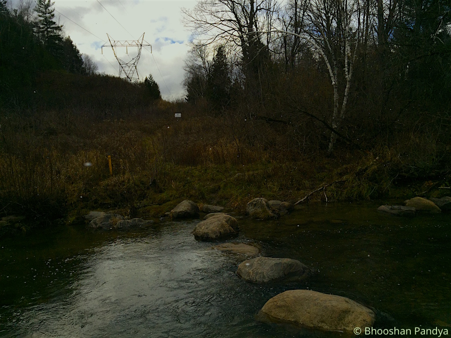
The cold weather and the winds were unrelenting. Within the first 15 mins of the trail I met a steep, never-ending hillock where I had to start dealing with a running nose and which would be an endless exercise throughout the hike. As well as certain muddy patches due to the overnight showers (we were informed about this situation) that provided some challenge for me. The plunge I had taken during the hike last week was still afresh and though I did slip a few times in the mud it wasn’t much serious but did race my heart a bit. At one point, we had planned to cross the West Duffins Creek stepping on large boulders to make the trail interesting, but unfortunately the waters had risen quite alarmingly almost submerging the rocks. Some adventurous hikers in the team brought along a tree log from the bushes in trying to form a bridge. But that plan was dumped as quickly as it materialized because the log was very unstable and it would have caused a human disaster of an unimaginable size.

The terrain along the densely wooded area disguised itself with leaves and tree roots that reminded me once again of the Durham Regional Forest (but no biking trails this time). Also a reminder that I should be cautious in deciding my next steps (literally). We were supposed to keep up a speed of 5.5-6kmph all along the way but found that some members had started to feel the exhaustion quite early and we had to stop at regular spots to let others catch up. This became more prevalent when we headed back towards the starting point post-lunch. After a long arduous walk in the flurries and wet terrain, we settled in a dingy shed at the Whitevale Park for our meals. The flurries had given way to a nice snow shower which came down heavily. The green park was bathed in white, and so ravishingly. My hands were freezing outright as I tried to munch ferociously on the Falafel burrito and finish it faster so I can get my hands tucked inside my jacket as quickly.

As we continued beyond the park we took deviated from the main trail to explore the Whitevale Dam, where I quite ignorantly assumed we had reached the end of the trail to turn back. A really simple and a short dam built to offer a physical barrier to separate migratory fish species such as rainbow trout and chinook salmon (downstream of the dam) from native brook trout (upstream of the dam). At which point the Sun came out briefly as we scanned the beautiful marshy landscape near the dam, as the flurries returned. Continuing onwards to Green Park parking lot the path became more smoother and muddier once we passed under the 407. It was around 1-1:15 PM when we reached the destination to turn back. We had maintained a steady pace of 5.5-6kmph which still did not satisfy certain members of the group. They wanted the pace quicker! Nevertheless given the muddy and hilly terrain I thought I had done well, though admittedly my confidence levels were at an all time low criss-crossing the swampy patches.

We turned around to go back. At this pace it was likely that we would reach the starting point at the Concession 3 parking lot by 4:45PM. After we passed the Whitevale Park (where we had our lunch before) I took the lead with another member until the Clarkes Hollow Parking. We went with such ferocious pace meeting the trail bends and the hillock, almost jogging through the woods, that the distance between us and the rest of the group widened. We had no choice but to wait for them and take a breather. The downhills before had now become uphill leading to even steeper climbs post the lunch period. The exhaustion had begun to set in for some members, and quite rightly so, while I was working hard to keep the momentum from dropping. The exhaustion wasn’t personally felt until I reached the end at 4:15-20PM but it wasn’t as much as a little soreness. We had picked such amazing pace that despite the halts we took we still managed to save 30 minutes from the overall hike time. It was yet another awesome hike that ended, that goes straight into my book of memoirs.

Design Case Against Gmail Tabs

Gmail Tabs was meant to handle email clutter in the primary inbox and optimize the email experience. Surely enough it was an exciting news for Gmail fans, and before I knew I had activated the feature on my account. So now I had five tabs (or inboxes) in Gmail where emails from different sources were automatically redirected into Primary, Social, Promotions, Updates or Forums tabs. You could also drag an email to any of the tabs, so that Gmail could recognize and deliver future emails to its respective inbox tab. And I was happy with this arrangement until I realized it had started to cause me inconvenience in managing different tabs or inboxes at the same. Using the Gmail app on iOS correspondingly was even more annoying because it increased my time (tap ratio) to reach specific emails and take action. As time went by I cared less about prioritizing my emails and more about organizing my emails. In fact I lost complete control over my emails and conversations and decided to do something about it.

There are email updates such as newsletters and account details, new sign ups, login notifications, verify email address, et al., and social media messages such as Twitter and Facebook notifications and then Spam, they all could be deleted or preserved (labeled appropriately and/or Archived) depending upon the value of the information.

In that sense Gmail Tabs brought a behavioural change in email interaction. There was a logical movement of the eye (scanning) in the traditional email list navigation model following a Receive > Read > Act > Delete/Preserve task flow. In other words conversations were easily identifiable through a comprehensive visible list of messages.

Traditional Inbox

Traditional Inbox with Email Listing (in red)

When Gmail Tabs introduced several inboxes within a large mailbox scanning became a matter of choice. And since each tab represented an inbox with emails delivered in volume at the same time, the focus shifted to reading emails in the Primary inbox (since they tended to represent real email senders), while taking it easy on the rest of the tabs. So when tabs presented multiple choices to the user it inhibited the person to make a decision.

Priority Inbox Feature

Gmail’s inbox feature with tabs (& unread emails)

Here’s why I believe Gmail Tabs was a design failure over the traditional Inbox design. This feature by its inherent network of tabs hid information and persuaded users to ignore emails and not motivate them for further action. For example receiving email in any of the tabs other than the Primary mailbox would either be read or ignored but never deleted. And storing all those trivial emails not only bloated my Gmail account it also overshadowed important conversations and added to the clutter.

For me nothing works like the original inbox mail listing feature now that I’m using it again. I can now control whether emails stay or go to the Bin the minute I receive them. The list design pattern provides early clues on information and doesn’t afford for conversations to hide behind tabs. Now that the original Inbox listing is back for me I noticed a ton of unread emails. So excuse me, while I clear this email mess!

Usability vs UI vs UX

Usability vs UX – Deciphering The Terms

The web abounds with discussions on Usability or UX (user experience) design mostly revolving around the concepts of ‘delight’. Let us look at the definition of ‘user experience’ which I found on Google:

The overall experience of a person using a product such as a website or computer application, especially in terms of how easy or pleasing it is to use.

The simplest interpretation of the word pleasing would be creating delight while using the system (or any other product). Some would define UX as the emotional aspect of a product while Usability tends to deal with the physical facets of software — the Look versus Feel scenario. Here’s how usability is defined on Wikipedia:

Usability is the ease of use and learnability of a human-made object. The object of use can be a software application, website, book, tool, machine, process, or anything a human interacts with.

The ease of use and learnability aspects are striking in the context of UX because both are emotional connotations for delight. So what exactly separates UX from usability? While much has been written about UX the more you indulge in its multifarious definitions, the more confusing the interpretation becomes in the context of general design. Thus I have come to conclude that applying the principles of usability in product development consistently derives long-term benefits in user-experience design.

Usability Engineering in context with software design is defined as Human-Computer Interaction or HCI although its principles have been employed in several key areas such as the aviation industry much before the first computer screens flickered on the horizon. Usability is broadly a set of principles specifically laid out through continuous user research that aims to bring the human viewpoints of psychology and physiology into consideration while designing a user-friendly product. The principles of Usability as defined by ISO cover learnability, efficiency, memorability, error handling and satisfaction for software development. Satisfaction — isn’t satisfaction a subset of delight or user experience? So if a design process exploits these usability principles and creates a user-friendly environment for usage, the outcome should naturally provide for a good user-experience for its customers.

I believe that usability has an overarching effect on products — be it on an enterprise-level application or a mobility app, or even a ubiquitous product such a chair, the principles of usability are relevant and are bound to affect humans emotionally as they interact with the object frequently. So while summarizing how usability can provide delight or how UX is intrinsically linked with classical usability, let’s take the example of a coffee-maker in context with the usability principles we discussed earlier:

Learnability: The product that is designed must be easily comprehensible (affordance) so as to reduce the learning curve and meet the set expectations or user goals. For instance, a coffee-machine which can make a cup of coffee for the consumer quickly and with fewer button clicks, and without having to read the manual (actually why would anyone need a user manual for using a good product?).

Efficiency: If the product is learned easily and quickly on repeated use it naturally affects the efficiency of its users in a good way. Making that first cup of coffee on a new machine took some time then let’s say, preparing the tenth cup.

Memorability: Once a user has been educated it raises his/her awareness about using the product features and increases the level of memorability (designing for recognition over recall). This makes the user confident, bestowing a higher amount of self-esteem from each product interaction which eventually raises the product brand value as well. So now you are so confident in making coffee on the new coffee-maker that you no longer required to focus your mind and energy on the buttons or the flashy lights. It just works magically! (or so your brain starts to believe!)

Error Handling: Once a product has reached a high state of awareness within its user base and the brand worth has been attained, the effective rate of error recovery would normally be reduced. Or discovering newer ways for product upgrade through user testing and feedback, and design iteration during product development lifecycle. If the coffee-maker beeped previously to signify an error consistently, what can be done to reduce that occurrence by bringing a change in product ergonomics?

Satisfaction: having met the expectations of the user, and an increased brand worthiness through design rationale, the overall experience is thus deemed pleasurable for the user. In other words, the goal for good user-experience design has been achieved so far.

While we know that usability for software is quantifiable through an expert review or usability lab testing. At this point, I have mostly found testing metrics for user-experience design referring back to the usability engineering testing tools and methodology which is rather disheartening. So while we continue to build products focussed on UX I would also be keen on applying my knowledge and skills substantially to usability engineering studies and research papers. After all, a product which addresses the mental model of the audience succeeds in providing a delightful experience as well.

Further Reading: The Resource Centre contains a collection of thought-leadership articles on Usability and UX from the Internet.

Apple Reinvents the Pencil

Apple’s Chief Design Officer Jony Ive was in conversation with the Editor-in-Chief of Wallpaper magazine Tony Chambers on Apple Pencil, and spoke at length about the design of the device as well as Apple’s design philosophy in general.

I had declared before that the Pencil was going to take the world by storm with its innovative UI and multi-functionality design along with the iPad Pro. At the core of the design philosophy for Pencil, Jony says, was the ability to use a device to paint and draw:

What we found is that there’s clearly a group of people that would value an instrument that would enable then to paint or draw in ways that you just can’t with your finger. And I suspect that this isn’t a small group of people. I don’t think it’s confined to those of us who went to art school.

For some time after the Pencil’s announcement the world was up in arms quoting Steve Jobs on introducing a so-called “stylus”.  Apple was fundamentally violating a design principle because Steve Jobs famously considered using a stylus as a sign of product “failure”. In reality the Pencil augments the finger as Jony Ive describes it vividly in this quote:

the Pencil is for making marks, and the finger is a fundamental point of interface for everything within the operating system. And those are two very different activities with two very different goals.

Suggesting that the Pencil is more than just a stylus and not replacing the finger interaction which Steve Jobs implied. The Pencil is in fact a successful merger of human dexterity with innovative technology. In which the Pencil not only identifies hand pressure but also the tilt angle on the screen to offer a seamless screen interaction. We often discuss Apple being an organization in the forefront of using design-thinking methods for developing innovative products:

We do this a lot when we are working on things like the trackpad or new keyboard on the MacBook. To develop those sorts of devices requires an incredible amount of observation and measurement and it means that you need to ask the right questions and know what to focus on. This is part of the value of being a design team that’s been together for many years. We’ve been working on these problems for 20-plus years, so it’s an interesting area. And I think we are gaining experience, we are learning.

Jony also brought up Apple’s design method which does not involve Focus Groups which is a well-known fact again. Here’s his take on whether the feedback from his young kids proved useful in the design of the Pencil:

Apple does not do Focus Groups – So far, anecdotally – you know we don’t do focus groups – but anecdotally, certainly from what I’ve seen, with my children and friends’ children, they are captivated.

And finally, he left a valuable tip for aspiring designers to inculcate design culture in their work:

The design team at Apple uses sketchbooks and do lot of sketching – Yes, we all do. The whole team use sketchbooks. I think it’s a mixture of drawing either by yourself or when you’re with people flitting between conversation and drawing.


iPad Pro and Apple Pencil – First Impressions

With loads of emotions, I had been awaiting the iPad Pro and Apple Pencil launch since Apple announced the breakthrough products in September 2015. The day finally arrived last weekend when I visited the Apple Store.

Disappointingly, my first impression when I held the iPad Pro was it just felt like a normal iPad! It wasn’t anywhere closer to the picture I was harbouring in my mind, of a large sheet of fine glass and slightly bulky device. Somewhere that tweet about the iPad Pro form factor feeling like an iPad Air 2 came true. Or maybe what I was feeling with the iPad Pro was a victory for Apple’s ingenuity in industrial design! Making something as powerful as the iPad Pro and letting the ergonomics sync with the present generation iPads. The new Smart Keyboard as well is a well designed and an exclusive accessory for the Pro. On the flip side we will have to wait for the next iPad Pro version to see the breakthrough 3D Touch technology at work which made the iPhone 6S series special in so many ways.

The Pencil’s story is quite different. I had used the FiftyThree Pencil last year but wasn’t too happy with the pressure sensitivity and the woeful response of the ‘stylus’ on the iPad. It required me to hold the tip in a certain way to touch the screen to draw something. The tip was rubbery and basically the experience never felt closer to a real pencil which I was initially expecting when I bought the product. The Apple Pencil feels every bit like the real stuff. The tip is hard and sensitive and detects the pressure points quite beautifully. It works even when you tilt it. The Pencil and iPad Pro combination is exciting – both are meant to work together actually, and a perfect platform for artists or architects to run their imagination wild. I’m already foreseeing a new genre of digital artistic wave being generated as a result of this innovative product from Apple. Now with Evernote supporting Apple Pencil it’s no doubt a fantastic device for everyone (and doodling takes a whole new meaning). I can’t wait to see what the upgrade for these devices has to offer.

“We didn’t really do a stylus, we did a Pencil. The traditional stylus is fat, it has really bad latency so you’re sketching here and it’s filling the line in somewhere behind. You can’t sketch with something like that. You need something that mimics the look and feel of the pencil itself or you’re not going to replace it. We’re not trying to replace finger touch, we’re complementing it with the Pencil.” – Tim Cook