product design

Playstation Knobs That Could Have A Unique Tone

Playstation Buttons

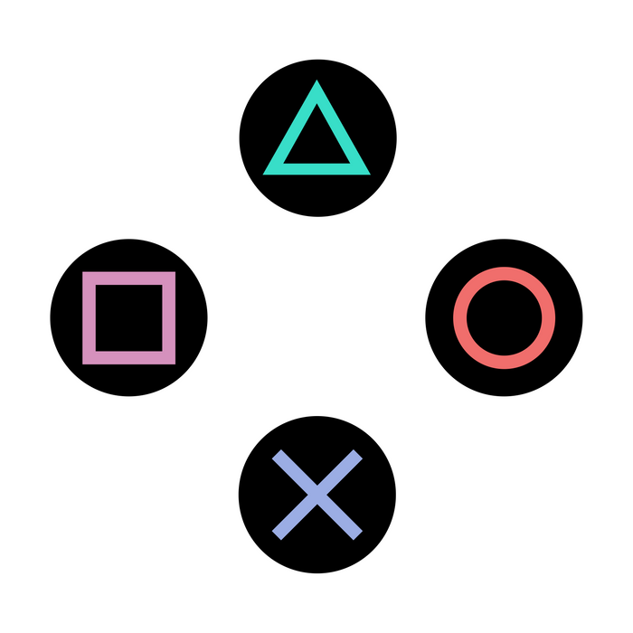
If you’ve been a kind of a gamer, you can’t miss out on those 4 colourful ubiquitous signs of the PlayStation controller. On the other hand, there are chances that you completely miss their significance beyond using them as primary controls for interacting with the game environment. PlayStation logo and product designer Teiyu Goto explains the real reason behind choosing symbols over alphabets, which previous generation consoles were already doing, and it makes total sense:

Other game companies at the time assigned alphabet letters or colors to the buttons. We wanted something simple to remember, which is why we went with icons or symbols, and I came up with the triangle-circle-X-square combination immediately afterward. I gave each symbol a meaning and a color. The triangle refers to viewpoint; I had it represent one’s head or direction and made it green. Square refers to a piece of paper; I had it represent menus or documents and made it pink. The circle and X represent ‘yes’ or ‘no’ decision-making and I made them red and blue respectively. People thought those colors were mixed up, and I had to reinforce to management that that’s what I wanted.

Techcrunch

It’s not so much the design or the use of geometric shapes which are just perfect for a suggestion method & recall during the gaming interaction, but the colours of the ‘circle’ and the X that has got me all knotted up — based on Goto’s theory the ‘yes’ or ‘no’ decision markers should have been green and red. Ultimately, the buttons serve a different purpose today regardless of their conceptual origins. Speaking of which, maybe the red and blue for ‘yes’ and ‘no’ might find its inspiration from the Japanese traditions and culture?

It’s widely noted that more often than not colours are mere tools for marking a differentiation on the user-interface with the element, just like the four different shades of the geometric shapes. Today, one could conclude that the green, red, blue, and pink tones on the Playstation consoles are not just any colours but elements that are identified by an entire gaming generation as the basis for creating a strategy with a recreational intent, and for making advancements into the story. The time to make those subtle changes in the colours might have passed a long time ago.

Apple Products

Here’s Why Apple’s A ‘Design-First’ Company

It won’t come as a surprise for a generic world-class electronics company to squirm at the mere motion of discontinuing any present-day technology that is evidently in rampant use with its current user-base, including peripherals or hardware systems. Imagine the plight of several million loyal customers when they hear how their favourite features and functions have been impertinently withdrawn with immediate effect from the brand’s high-end product line. But of course, we aren’t talking about Apple.

Here’s what everybody, including most designers, gets it completely wrong about Apple whenever the discussion surrounding its deeply intricate ‘design philosophy’ happens. There will be an unequivocal and optimistic pronouncement that Apple’s success is due to its “user-first” mindset. It’s not and it never was. On the contrary, Apple’s innovation strategy is ingrained in making its products future-proof by pursuing a ‘design-first’ framework in a valiant effort to promote and invest in technologies, which in Steve Jobs’ prophetic words, are having an upwards swing. That pursuit of integrating innovative technology is partly the reason why some of their design decisions seem impractical and in complete contradiction to current technical norms. The unpopular decision behind the removal of the headphone jacks from the iPhone 7, for instance, was necessary to make the device thinner and add space for larger batteries in a world that is hankering for more juice. That single design change has virtually turned the tide towards wireless Bluetooth headset manufacturers and prompted iPhone buyers to shop for them (read, ‘AirPods’) and has sparked a wave of innovation in the industry.

[…]Apple is a company that doesn’t have the resources that everyone else has. We choose what tech horses to ride, we look for tech that has a future and is headed up. Different pieces of tech go in cycles… they have their springs, and summers and autumns, and…then they go to their graveyard of technology. And..so we try to pick things that are in their ‘springs’ and if you choose wisely you can save yourself enormous amount of work versus trying to do everything, and you can really put energy into making those new emerging technologies be great on your platform rather than just ‘ok’ because you’re spreading yourself too thin. […] So we have got rid of things..we were one of the first to get rid of the optical drives with the MacBook Air, and I think things are moving in that direction as well. And sometimes when we get rid of things like the floppy disk drive on the original iMac people call us crazy. But sometimes you just have to pick the things that look like they’re gonna be the right horses to ride going forward.

Steve Jobs – D8 conference, 2010.

So, where modern PC brands were feverishly banking on the ubiquitous USB Type-A on the basis of its adoption rate and the competition Apple boldly moved forward to replace them with USB type-Cs on their Mac devices. It’s a debate for another day that Apple’s ‘design-first’ decision on the 2015 MacBook also prompted an extravagant usage of physical adapters to attach almost any 3rd-party Type-A peripheral on almost every major device launch.

Continue reading…
2018 Apple MacBook Pro

2018 Was An Impressive Year For Apple

We’re still a few weeks from saying our goodbyes to 2018, and unless Apple is planning to hold an unprecedented fifth keynote this year, 2018 will go down in history as the year when Apple launched a range of innovative products. In the hype and the hoopla that generally accompanies all Apple events; some individuals might even be vindicated in assuming they are just normal product launches, although undoubtedly the company has given us a sneak peek into its future direction of integrating the best-in-class design and tech elements into great-looking, innovative products. In short, there has never been an exciting moment to anticipate which product and tech iteration Apple would demonstrate at their next glittering event.

2018 should set the tone for Apple’s future design roadmap

It was last year when Apple’s approach in breakthrough hardware and software design gained fruition and we finally began to see the perfection with Apple’s design iterations. To cite an example, it was September 2017, when along with the Apple Watch Series 3, the Apple TV 4K, the iPhone 8 and 8 Plus, Apple unveiled a revolutionary form factor of its flagship product the iPhone X on its tenth anniversary. The bezel-less design of the iPhone X was what impressed many, a paradigm shift in the iPhone ergonomics that was hitherto accompanied by a home button. The new form factor certainly met the expectations of the markets but then it was also the introduction of the Face ID technology a new generation of secure digital authentication which also made a mark. In a nutshell, that event marked a significant detour in the way products were going to be designed and integrated with advanced technology. In fact, not very long ago, I had mentioned a critical aspect of Apple’s future design roadmap that was supportive of modern & imminent technologies and in the process, they were also influencing behaviour change with user interaction. That being said here’s what I liked from Apple’s ‘orchard’ this 2018, 3 revolutionary product ideas with their underlying hi-tech, that I believe would eventually transform the way we interact with the world around us, and my strategic learning from the product launches so far.

Design Iterations in the form factor for the iMac
Instance of design iterations in the form factor for the iMac

The product design philosophy of Apple could be easily summarized with this insightful quote by French aviator and poet Antoine de Saint-Exupéry, he says, “perfection is achieved not when there is nothing more to add, but when there is nothing left to take away.” That sentiment is so deeply ingrained in every aspect of Apple’s design DNA.

Continue reading…

Canadian Tech and IT Jobs in 2018 from Randstad

Randstad Canada sent me an email update today titled “Boost your job search in 2018”, in which they included data on Tech and IT related jobs within Canada. Randstad is one of the many staffing agencies in Toronto and they share this data every year, along with the salary range for different roles categorized by Canadian cities which helps job-seekers in tweaking your job search outlook. What surprised me was the absence of any designer/creative role in software development, so where did they go wrong? They have information for UX/UI job seekers on their website which is not part of the 2018 report though, and I have blogged about my hiring methodology to stress upon the importance of getting creative designers onboard for any product development lifecycle.

The UX Design Collective released The State of the UX in 2018 survey in which they have spoken widely about various global UX career trends and one of the key lessons was the rightful transformation of the UX Designer into ‘Product Designer’ in 2018.

[perfectpullquote align=”right” bordertop=”false” cite=”” link=”” color=”” class=”” size=””]This shift from UX Design to Product Design is only accelerating in 2018. As our role and responsibilities grow inside our companies, understanding more about business and design strategy becomes inevitable.[/perfectpullquote]

Could it be that Randstad ignored this trend of UX Design vs Product Design? If the report mentions tech as “one of Canada’s best job sectors” then digital products could be the driving force behind it and generally, creative design skills should rank higher in demand on par with programmers. I believe it’s a matter of perspectives, and that Randstad got too involved in pursuing “IT/Tech” as an exclusive developer’s domain while keeping the strategic/creative angle outside its purview. Only they could tell why, but 2018 is the time to give the creative (product) designers a fair handshake!

Source: Best Tech and IT Jobs in Canada in 2018 by Randstad Canada

Quotes from ‘Steve Jobs – The Lost Interview’

Steve Jobs - The Lost InterviewThis is one of my favourite documentaries on Steve Jobs, an interview with the legend who’s at his best reliving his time at Apple, NeXT, and beyond. It’s full of anecdotes from his thought process on product design, and why Microsoft is after all…Microsoft and I thought to reproduce some of his insightful quotes. This interview was conducted by Bob Cringely in 1995, it was lost until the director of the series found a VHS copy in his garage, and released to theatres in 2012.

At a time when technology has virtually seeped into our psyche, this interview brings a tremendous insight as to how far we have come, and especially for Apple as a company as it continues to innovate.

On Becoming a Millionaire at a Young Age

“I was worth about over a million dollars when I was 23 and over $10 million when I was 24 and over $100 million when I was 25. And it wasn’t that important because I never did it for the money. I think money is a wonderful thing ’cause it enables you to do things. It enables you to invest in ideas that don’t have a short-term payback and things like that. But especially at that point in my life, it was not the most important thing. The most important thing was the company, the people, the products we were making, what we were gonna enable people to do with these products.”

Continue reading…